Brand Identity / Packaging
2025
Work

First Designs

Second Iterations

Final Designs
Overview
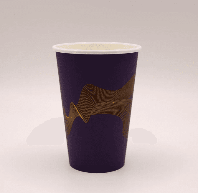
Designed the packaging for Cosmo Cups, a vending machine cup range for GM Packaging, from concept through to print-ready artwork.
Brief
GM Packaging wanted a redesign of their 9oz and 12oz vending cups. The original direction — soft pastels with minimal linework — didn't appeal to a wide enough audience. The feedback was direct: it needed to work for a broader market, including more traditionally "masculine" appeal, while staying clear of a close competitor's existing vending cup design, which the original pastel concept was sitting too near to.
My Role
Packaging design for the 9oz and 12oz vending cup range, from initial concept through client feedback and revisions to final print-ready artwork. Designed independently.
Process
The original pastel concept was reworked from the ground up. Several new directions were developed using darker, more neutral tones, with variation in line weight and placement tested across each option to keep the pattern distinctive rather than decorative.
Design Decisions
Rather than leaning into obvious "masculine" cliches, the redesign kept a contemporary, stylised and minimal foundation, but reworked the linework to feel more neutral and broadly appealing. Adjusting line thickness and positioning also gave the design enough of its own identity to move away from the competitor pattern GM Packaging wanted to avoid echoing.
Outcome
GM Packaging chose a direction built around their brand colours, with a reversed colourway for the 12oz cup to distinguish it from the 9oz. Both are now in production and sold on GM Packaging's website for vending machine use.
Style References
Contemporary vending and takeaway cup packaging, minimal line-based patterns, stylised geometric motifs — refined to sit clearly apart from existing designs already in the vending market.